Use of Pantone Shades in Renovations
Colors and light have a great impact on the atmosphere and mood of a space, which is why it’s essential that you get both right to create a space where you’ll feel your best.
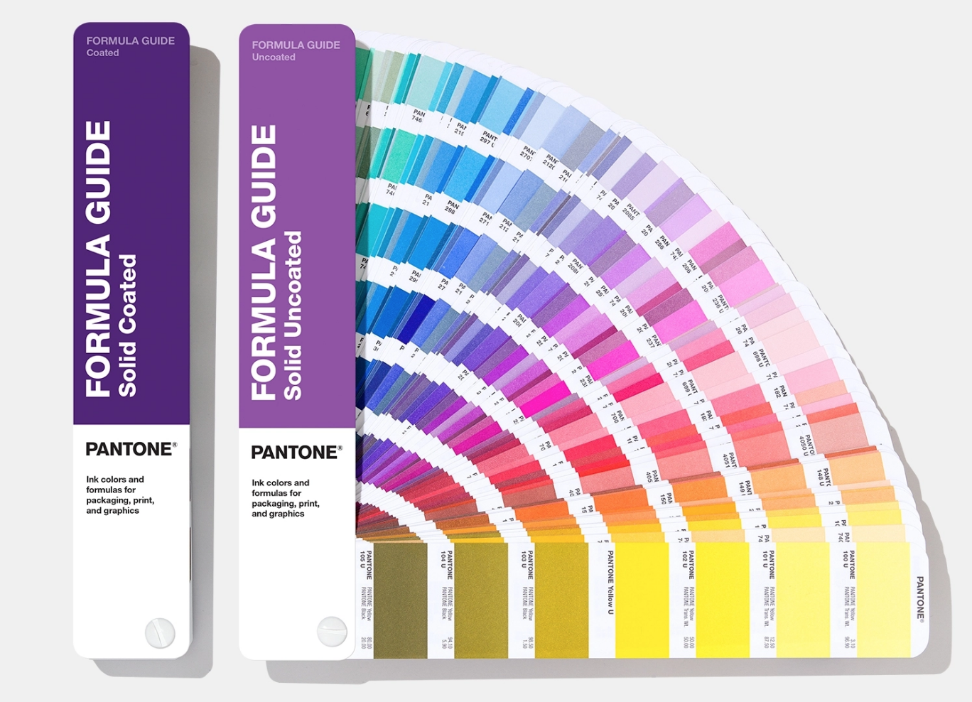
As you may already know, each year, Pantone chooses a color of the year to inspire artists, designers, and other creators to use it in their home decor, clothes, art, and other creative endeavors. We’ve decided to give you our two cents about how you can use Pantone shades in your renovations, so let’s first see what it’s all about.
The 411 on Pantone Color of the Year
You may ask yourself, why would this company that’s been around for over 60 years take the time to choose a color of the year?
Well, the process of selecting the Pantone Color of the Year has been influencing various industries, such as the fashion industry, graphic and industrial design, architecture and home furnishings, and product packaging and development for over 23 years. So, this seemingly unimportant choice drives a lot of different consumer purchases across different markets, which is why it’s become an important color trend forecast nowadays.
How Does the Pantone Color Institute Choose the Color of the Year?
The Pantone Color Institute is one part of the Pantone company. Their work mainly revolves around selecting the Pantone Color of the Year, selecting global color trends, and working with companies to improve their brand’s visual identity and the colors of their future products.
They conduct extensive research on current trends, the fashion and entertainment industries, the work of emerging artists and designers, art collections, architecture, and much more when deciding on the color of the year. But that’s not all. The Color Institute also does psychological research into how their color choices affect people, their lifestyles, and their purchase decisions.
As a result of this careful research, the Pantone Institute chooses one color that usually dominates the design market for the next year, apart from 2021, when Pantone chose two colors.
Using the Pantone Color of the Year in Your Renovations
Now that you know the story behind why the company chooses one color each year, let’s see how you can use this color as an inspiration for your design and renovation projects.
Pantone’s Color of the Year for 2022 is Very Peri, which, as Pantone spokespeople said, is a color that "animates our creative spirit, helps us to embrace this altered landscape of possibilities, opening us up to a new vision as we rewrite our lives."
This year’s color was a symbol of the transition that people are going through, as the world is slowly transitioning from isolation to socialization, and also alludes to the digital space and the metaverse, which are becoming more and more popular this year.
Very Peri is a type of blue with a violet-red undertone that gives the space a dynamic aura and stimulates imagination and creativity. Let’s see how you can implement this and other Pantone colors to design the home of your dreams.
Complete Home Renovation Using Pantone Shades
When you’re starting from scratch, it’s easy to incorporate as many new colors as you like because you have a blank canvas, so you can set your own color theme. Making your home design revolve around Pantone’s Color of the Year is one way to go about designing your new space, as you’re incorporating a color trend that’s popular across different industries.
Let’s take Very Peri, for example. As a color, blue-violet combinations are associated with royalty, femininity, and mystery. These two colors create a balance between the spiritual and physical energies and create a space that stimulates imagination and creativity. Using this color as your main color can add serenity and calmness to a space, especially if it’s the dominant color.
Making the Color of the Year the Dominant Color
A great way to go about renovating a home while also keeping in mind the color palette would be to use the 60-20-10 rule. To create a harmonious space, you’ll need to focus on having the right balance of the three main colors you’re planning to use, and they all need to go well together:
- 60% would go to your dominant color
- 30% would go to your secondary color
- 10% would go to your accent color
Balancing out the colors in this way will ensure that there are adequate amounts of all three colors, while the dominant color brings the whole room together to create an enchanting space.
Making the Color of the Year the Secondary Color
For some people, Very Peri might seem too intense to be used as a dominant color, but a great choice as a secondary color. This can be the best of both worlds, as you won’t feel overwhelmed with it, rather use it more strategically around your home.
You can do this by purchasing smaller pieces of furniture in that color and adding artwork, curtains, and other accessories. However, you don’t need to buy new furniture to include this color. You can reupholster an older piece of furniture or chair and change the secondary color of the room very easily. You can also visit an antique shop and look for furniture in that specific color, or even repaint some of the wooden furniture you have at home.
Making the Color of the Year an Accent Color
If you’re more into minimalism and a lot of whites, creams, and off-whites, you can always use the Color of the Year as an accent color to make your interior interesting without overwhelming it with too much color. Making a specific color an accent color can mean very different things, depending on the room you’re renovating.
If you take Very Peri as an example, you can include nightstands next to your bed in that color, add an interesting piece of artwork, or add some smaller decorations, such as vases or candles. You can use this color in the kitchen for decorative plates, glasses, or even your table setting. The possibilities are endless; you just need to do some research to figure out what your preferences are.
Partial Home Renovation Using Pantone Shades
If you only want to focus on renovating a single room, you’ll need to be a lot more careful during the design process to make everything go together. Let’s say that you’d like to renovate your living room, which is connected to your kitchen that you don’t want to change.
You can include a vibrant color as an accent color or secondary color if you don’t want it to clash with the color of your kitchen, or you could add some smaller objects of the same color in the kitchen, like flowers, so both spaces blend in together.
Keep in mind that you should use vibrant colors in moderation to avoid making your space look kitsch. Include decorative pieces such as lamps, curtains, and carpets if you don’t want to invest in new furniture but want to change up the color.
Planning a Home Renovation
If you’re unsure how to go about the renovation process if you’re doing it on your own, you may want to start from large to small.
First, choose the dominant, secondary, and accent colors. Let’s say that you’re using periwinkle as your accent color, dusty pink as your secondary color, and beige as your dominant color.
Second, color the largest surfaces, like the walls, in your dominant color, to which you may add some of the accent color to break the monotony. Then, you can choose a couch in dusty pink, your secondary color, and add pillows in different patterns and shades of periwinkle.
Finally, balance the whole space by adding pops of periwinkle here and there throughout the room in the form of candles, artwork, or other decorative pieces, to make the space feel more harmonious.
Final Thoughts
Before you start renovating and considering all these different factors that go into it, you’ll need to make a plan of execution. This plan will contain all the necessary steps, so you won't miss anything crucial. To sum up, we’ve included the most important steps that you wouldn't want to forget if you want your remodel to be successful:
- Hire an architect or a designer if you’re making bigger changes or ordering tailor-made furniture.
- Consult with a color specialist if you’d like them to work along with the other professionals to integrate the colors seamlessly (this will be especially beneficial if you want to have more color variety and you’re afraid that the colors won’t go well together).
- Have a budget for the renovation and have 10% extra in case any unplanned expenses come up.
- If you feel confident in your skills, you can DIY the whole project and find inspiration on Pinterest, ArchDaily, Architecture Digest, and other sources where you can find interior design layouts, furniture inspiration, and much more.
Once you’re done with the planning stage, and you’ve gathered the inspiration for the remodel, it’s time to start looking at different Pantone shades.
You can do this by analyzing which Pantone shades would work best with your existing furniture (if you’ve decided to keep some of it), which shades can be combined with the overall style and design of your home (if you’re renovating just one or two rooms), and what is the overall mood that you want to have in your space (if you’re doing a full-scale renovation).
Regardless of the extent of the renovation, make sure that you have all the consultants and designers on board with your vision for the space before you choose the Pantone shades, so you’re positive that everything will go well together once the renovations are finished.